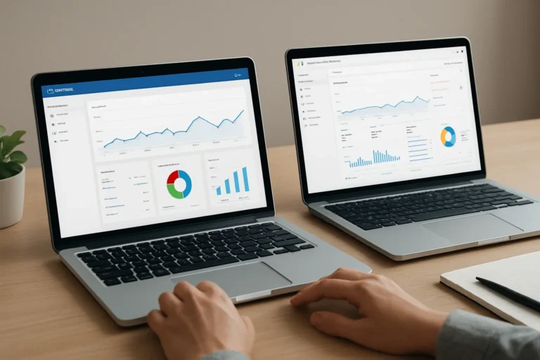
A sales dashboard should do more than display numbers. It should help management understand where leads come from, how they convert, and which channels actually support revenue.
Looker Studio is a practical option when you need one clear view of sales and lead performance across CRM, ads, forms, and analytics. The real value is not the chart itself. The value is faster decisions, better visibility, and a stronger link between marketing activity and commercial results.
Direct answer: what should a sales and lead dashboard do?
A useful Looker Studio dashboard should show lead volume, lead quality, conversion rate, sales by source, and the cost of acquisition in one place. It should help decision-makers see what is working, what is wasting budget, and where the pipeline is slowing down.
If the dashboard does not support action, it is only reporting. A good dashboard supports prioritization, budget allocation, and commercial follow-up.
Table of contents
Why does a sales and lead dashboard matter for the business?
Many companies collect data in several tools but still struggle to answer simple questions: Which channel brings qualified leads? Which campaign generates real opportunities? Which salesperson closes the most valuable deals?
Without a clear dashboard, teams rely on screenshots, exports, and assumptions. That slows down reporting and creates confusion between marketing and sales. A structured dashboard helps both teams work from the same numbers.
This matters even more for companies that need to improve visibility credibility qualified in competitive markets. When management can see the full funnel, it becomes easier to connect marketing spend to commercial performance.
What data sources should you connect in Looker Studio?
The dashboard is only as reliable as the data behind it. The best setup usually combines several sources so the company can see the full journey from visit to sale.
| Data source | What it shows | Business value |
|---|---|---|
| Google Analytics 4 | Traffic, sessions, landing pages, conversions | Shows which channels and pages generate interest |
| Google Ads | Spend, clicks, conversions, cost per lead | Helps control paid acquisition efficiency |
| CRM | Lead status, pipeline stage, closed deals | Shows lead quality and revenue impact |
| Forms and landing pages | Form submissions and source attribution | Connects website actions to lead generation |
| Call tracking or offline sales data | Phone leads and closed revenue | Completes the picture when sales happen outside the website |
For companies with a construction company website development project, a recruitment business, or B2B services, this connection is often the difference between basic reporting and real commercial control.
How should the dashboard be structured?
A dashboard should be built around business questions, not around available data. The layout needs to be simple enough for executives and detailed enough for marketing and sales teams.
1. Executive overview
This section should show the main KPIs at a glance: total leads, qualified leads, conversion rate, revenue, cost per lead, and return on ad spend when relevant. It is the first screen a CEO or marketing manager should see.
2. Lead source performance
This part should compare channels such as organic search, paid search, social, email, referrals, and direct traffic. The goal is to see which sources create volume and which create quality.
3. Funnel performance
Here the dashboard should show the path from visit to lead, from lead to opportunity, and from opportunity to sale. This is where companies often discover that traffic is fine but conversion is weak.
4. Sales performance by segment
If the business sells to several markets, regions, or customer types, the dashboard should separate them. This helps identify where the company wins faster and where sales cycles are longer.
How do you build a Looker Studio dashboard step by step?
Step 1: define the business questions
Start with decisions, not charts. Ask what management needs to know every week or every month. For example: Which channel brings the best leads? Which campaign generates the most sales? Which stage blocks conversion?
Step 2: clean the data model
Before building visuals, make sure naming conventions, conversion events, and CRM fields are consistent. If the data is messy, the dashboard will look professional but produce weak answers.
Step 3: connect the sources
Connect analytics, ads, forms, and CRM data. In some cases, you may need a connector or a prepared spreadsheet layer to standardize fields and merge sources correctly.
Step 4: design the KPI hierarchy
Place the most important metrics at the top. A good hierarchy reduces confusion and helps leaders focus on the numbers that affect revenue first.
Step 5: add filters and segments
Filters by date, channel, country, product, or sales rep make the dashboard much more useful. Without filters, the dashboard becomes too generic to support decisions.
Step 6: test the numbers against reality
Compare dashboard values with CRM records and campaign reports. A dashboard that is visually clean but numerically wrong can damage trust very quickly.
What should you compare, and what should you avoid?
| Useful comparison | Why it matters | Common mistake |
|---|---|---|
| Leads vs qualified leads | Shows lead quality, not only volume | Reporting all leads as equal |
| Cost per lead vs cost per sale | Shows real acquisition efficiency | Optimizing only for cheap leads |
| Traffic vs conversion rate | Reveals whether the website converts | Assuming more traffic always means more sales |
| Source vs revenue | Shows which channel actually sells | Judging channels only by clicks |
A slow website does not only create a technical problem. It creates a business problem, because visitors leave faster, Google has more difficulty crawling the pages and potential clients may lose trust before contacting the company.
The same logic applies to dashboards. If the structure is weak, teams lose trust in the data and stop using it.
How do SEO, GEO and AEO fit into this dashboard?
For many businesses, the dashboard is not only a reporting tool. It also helps measure organic visibility and content performance over time.
SEO data shows which pages attract qualified traffic. GEO, or generative engine optimization, helps teams understand how content is structured so AI systems can interpret it clearly. AEO focuses on direct answers, which is useful when measuring pages that should answer specific commercial questions quickly.
This is especially relevant for companies that want to support professional reassure european buyers, or for service businesses that need a dashboard to connect content, leads, and commercial outcomes. Clear reporting helps management see whether content is actually driving business value.
What is the business impact of a well-built dashboard?
The impact is practical. Teams spend less time preparing reports and more time acting on them. Marketing can shift budget toward the channels that generate qualified leads. Sales can focus on the most promising opportunities. Management can see whether growth is sustainable.
A dashboard also improves accountability. When everyone sees the same numbers, discussions become more precise and less subjective. That is useful for SMEs, startups, and companies preparing to scale.
For businesses that also need website development air conditioning, learning platform website development, or estate developer website tunisia, the principle is the same: the website and the dashboard must support commercial performance, not just presentation.
FAQ
What is the best KPI to start with?
Start with qualified leads, not just total leads. Qualified leads show whether the traffic is relevant and whether the website is attracting the right audience.
Can Looker Studio replace a CRM?
No. Looker Studio visualizes data, but it does not manage sales activity. It works best when connected to a CRM or another reliable source of pipeline data.
How often should the dashboard be updated?
For most businesses, daily or near-real-time updates are enough. The right frequency depends on the sales cycle and how fast decisions need to be made.
Why do dashboards fail in many companies?
They fail when the data is inconsistent, the KPIs are unclear, or the dashboard is built for display instead of decision-making. A useful dashboard must answer real business questions.
Should marketing and sales use the same dashboard?
Yes, with different views if needed. Shared reporting reduces friction and helps both teams align on lead quality, conversion, and revenue impact.
Need a dashboard that supports growth?
At THE ROAD, the goal is not just to create a visually clean dashboard. The goal is to build a clear reporting system that helps your company track leads, understand sales performance, and make better decisions.
Whether you need a new Looker Studio dashboard, a reporting structure connected to your CRM, or a broader digital setup that improves visibility and conversion, we can help with a practical and business-focused approach.
You have a web project, a redesign, or an SEO need? THE ROAD can support you with a clear, professional, and results-oriented approach.